


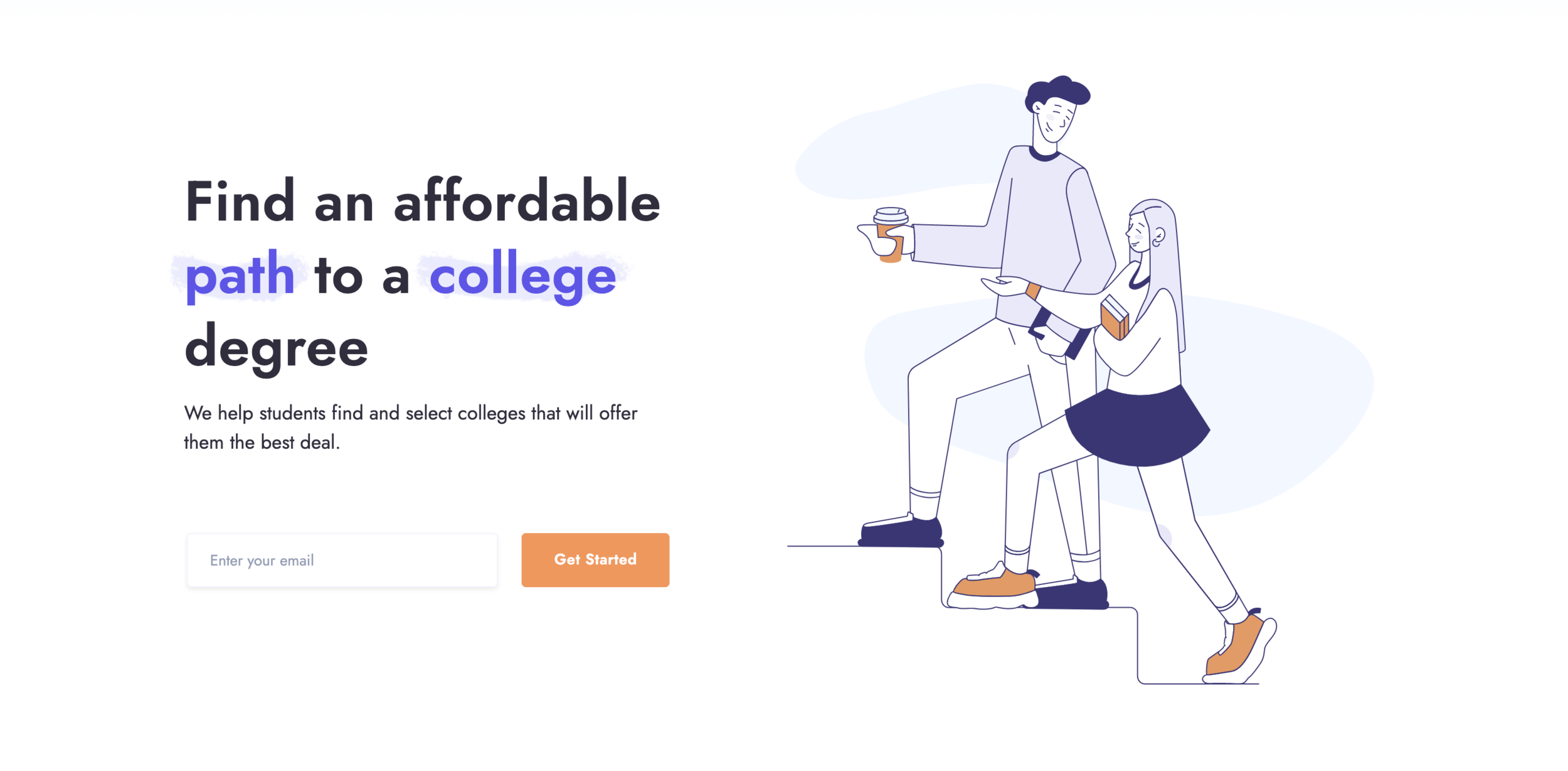
TILT
THE ASK:
Conduct evaluative usability research in order to identify challenges for first-time users on the Tilt platform and provide both short and long-term UI design suggestions to increase the overall usability of the site.
THE ROLE:
UX Researcher
THE SOLUTION:
Identify and present 3 major usability suggestions for the site. Summarize all research data and findings for stakeholder review.
Side Tab navigation - increase visibility for users to quickly understand how to navigate through site features
Page hierarchy - Reorganize page structure to match how users interact with search tools (first search bar, then filter, then sort)
Branded Copy - Clearly define copy to set expectations for user experience. Define two “main” user journeys aligned with how Tilt can add value to each.
THE PROCESS:
I designed and led usability testing over a two week period to collect key data points on individual features of each page on the Tilt platform. Specificity was important here because the insight will be used to develop product and brand design. It was essential to minimize assumptions through out this process.


Listening to User Experience
User tests took about an hour to complete and focused on dashboard exploration. I asked participants to describe their expectations for the site and what they hoped to accomplish before ever assigning a task to them. I circled back to this question at the end of each session to measure how expectations were met upon their initial experience.

Data Organization
Research data was organized digitally (but still on post-it notes) using Miro and key insights were distilled into “tasks” which were given a priority level. This prioritization helps teams visually identify the most effective and immediate changes that can be made. It is an effective way to get buy in from stakeholders when presenting research results. Everyone loves to start off with a “low cost” and “high impact” Jira ticket for the product team!


Deeper Dive
A second version of analysis took a deeper dive into user expectations and user journey based on branding, copy, and on-boarding. This affinity map attempted to understand the underlying user need and what they expected Tilt to help with. From this point, it would be effective to create a user persona and journey map to understand where users are coming from and the best way to guide them towards their goals.

Site Architecture
I combined the above analysis with specific notes about the UI and presented my findings to stakeholders along with a detailed summary in Notion.
Asking the Question “Why?”
While specific site details were a vital aspect of my user research for this project, I was also interested in the stories that users were telling about their lives and use cases. I wanted to collect qualitative evidence for WHY users would benefit from a product such as Tilt. Students fell into one of two major categories during my research: Discovery (collecting information about college) and Application (project managing applications). This insight helped me develop suggestions for the team at Tilt that was backed by the research.


INSIGHT
Jared Spool has talked about different levels of understanding within companies towards user experience. At the highest level, every employee at the company becomes an advocate for users and user research is performed over the life of the project.
For me, working with the Tilt team was glimpse into the progress that can be achieved in that scenario. Without needing to convince stakeholders of the value user research has to offer, you can get right to work!