Mobile Bank Accessibility
Is your banking app is accessible for all users?
THE CHALLENGE:
How can Coastal Credit Union create a more inclusive mobile banking app without changing the current information architecture?
THE SOLUTION:
Use key insights from usability testing to uncover pain points and simplify actions according to the most common user flows. Leverage icon design and high contrast color palettes to help users identify path options while keeping a pulse on how much data is presented on each page.


THE PROCESS:
Inclusive design thinking begins with the user. In order to know where users are being excluded from using the application, we must first listen to the users and collect insights. This can include quantitive data (correlation customer demographics and in-app activity) and qualitative data (user research interviews and task oriented usability testing).
Key Insights
Small fonts and low contrast images may be difficult to read for some users
Hick’s Law states that more options creates fatigue in decision making - Present as few options as possible at one time
Log-in issues can cause high levels of frustration in users who are unable to troubleshoot on their own.
Insight into design
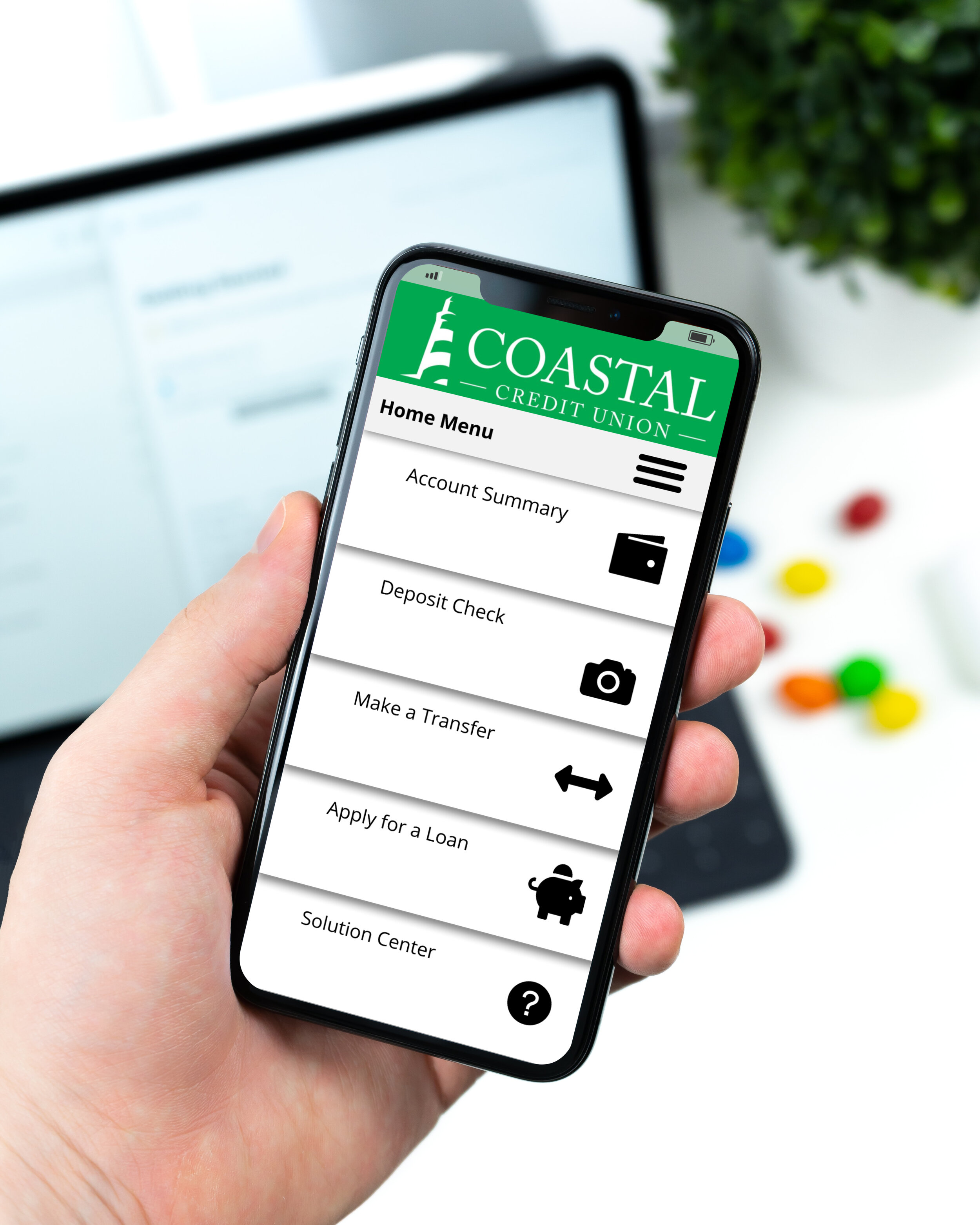
For users with sight impairment can benefit from the use of clear iconography. Leveraging high contrast icons to associate with menu options can be a clear way for users to navigate without grabbing glasses, zooming in, or exiting the app without accomplishing their goal.
User Flows
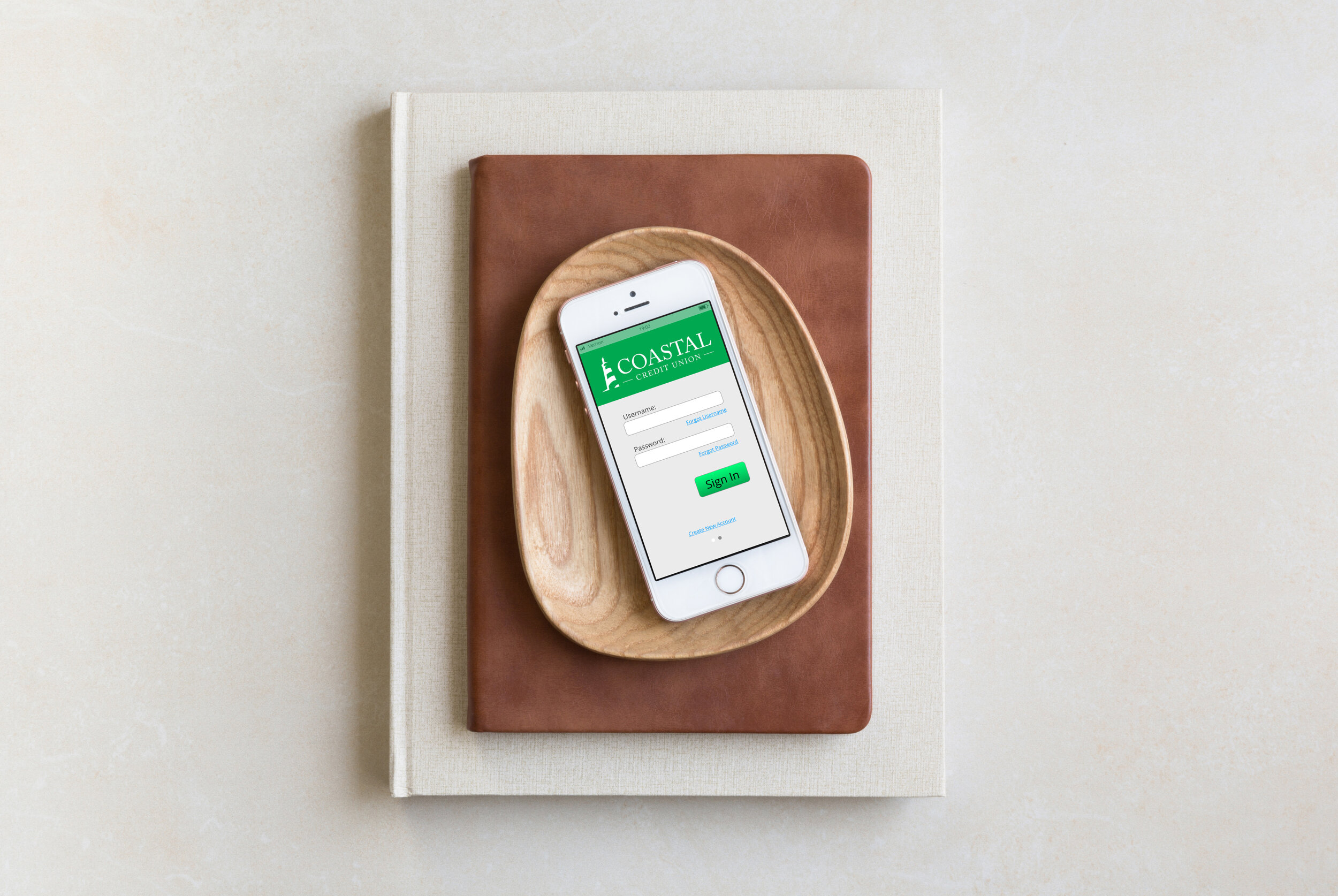
The log-in form may seem like a simple task for users to complete, but this can be a deal breaker for users who have a bad experience with this form. The bar is set low for the login experience so this is an opportunity to delight!
Mapping out a user flow for each major issue discovered during usability testing can reduce the possibility for users to get stuck. Creating a secure and effective way for users to recover their username and password can turn a dreaded experience into a delightful one!
Hick’s Law Applied
Hick’s Law states that the number of choices presented to users is reflected in their ability to make a decision quickly. This is a fantastic opportunity to clean the dashboard! By only presenting the top 5 most used tools, users will be able to decide where they need to navigate to accomplish their task.
This doesn’t mean we need to cut out functionality! By organizing “other” tasks under the hamburger menu button, we can retain all app functionality and let users explore additional tasks in a new environment. This, again, will cut down user fatigue as they will be presented with fewer choices in both the dashboard and hamburger menu.
Prioritizing Information
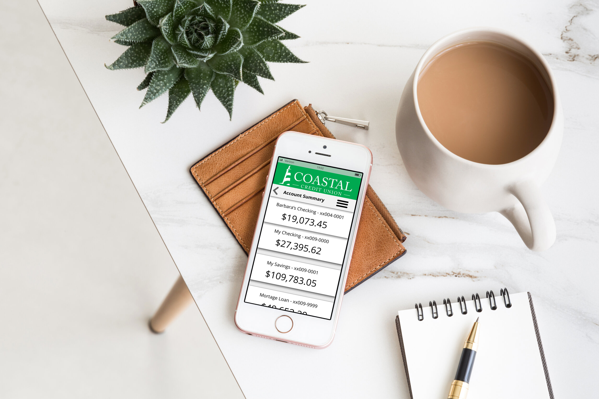
User research will confirm what information needs to be prioritized within banking applications. MAKE IT STAND OUT.
Utilizing large fonts and high contrast white space will provide users with a sense of organization and satisfaction knowing they can quickly access the information they need with no other details attached


